

A full rebrand, content strategy and website for BankCheck. Providing world-class payments and KYC data with proactive support to the global banking community.
BankCheck needed to transform their brand to reflect the true value of caring about their clients needs while providing accuracy and expertise.
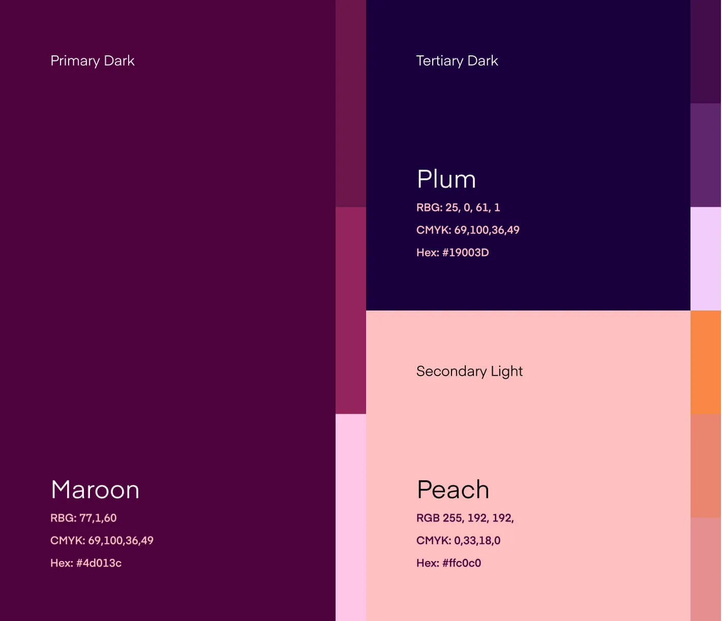
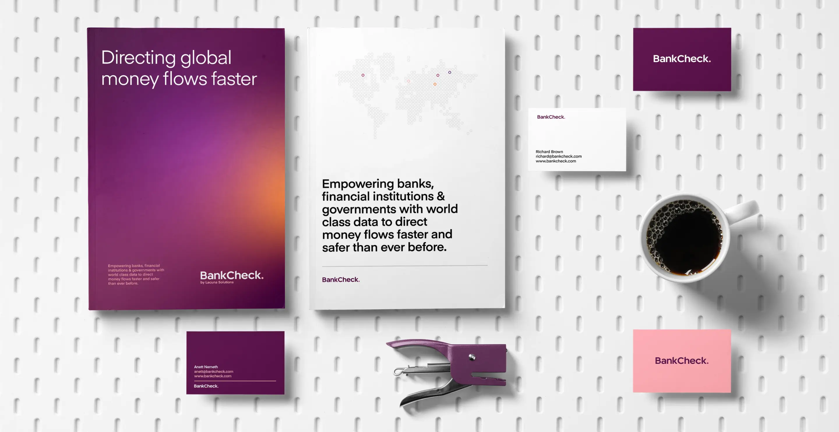
We started as always with discovery, understanding their market position and company voice. Once we established a solid understanding we began to explore how we could translate this in the form of an identity. The clear message was that the team wanted a type only idenity vs a single mark, so we began crafting.

No items found.
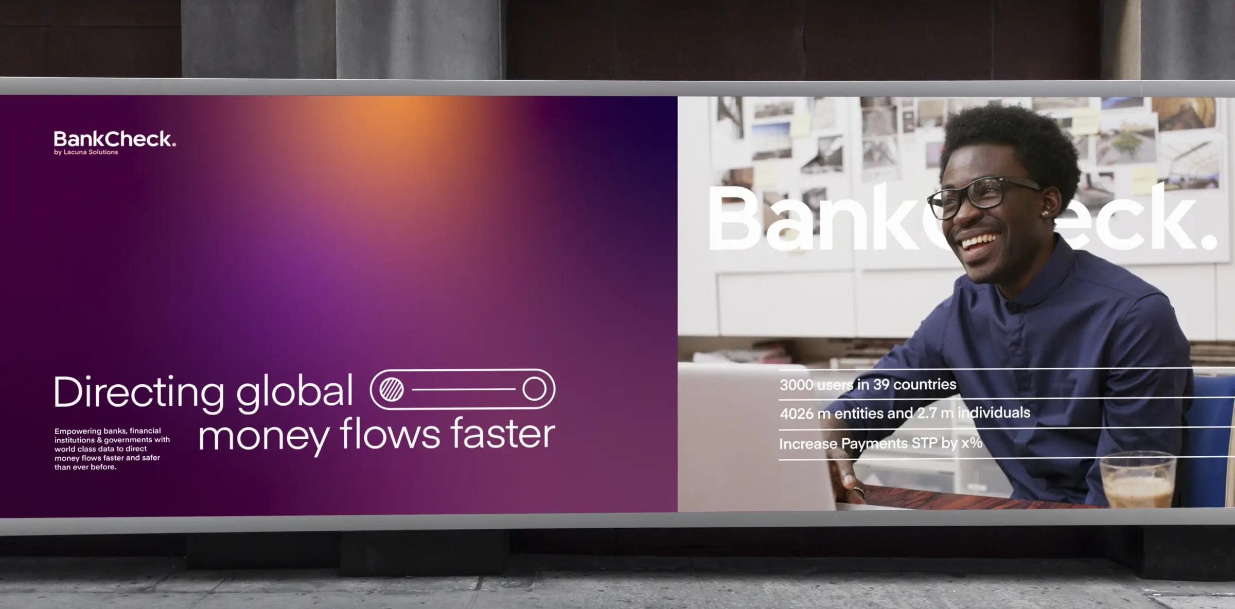
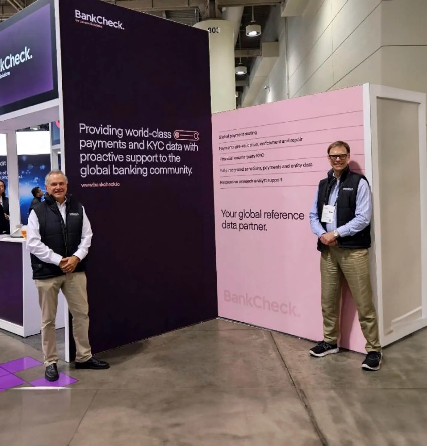
We had a big push to get the brand complete so the team had everything they needed ready for the SIBOS 2023 in Toronto. The team had a successful event showcasing the new brand and their position in the market.


No items found.
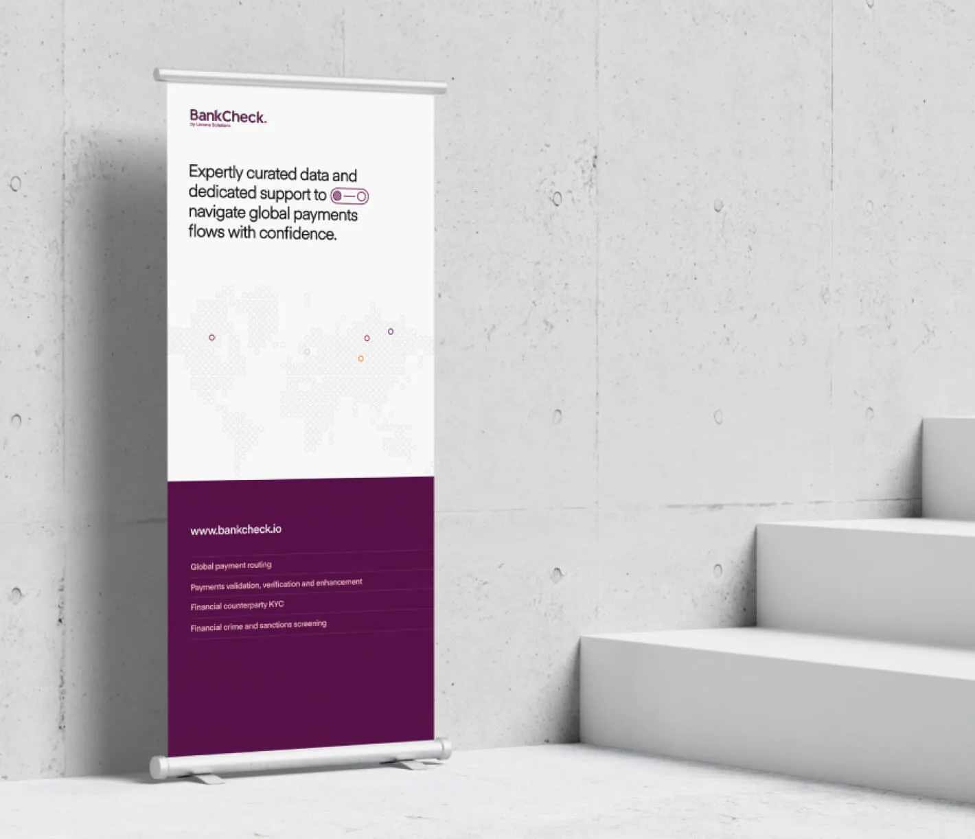
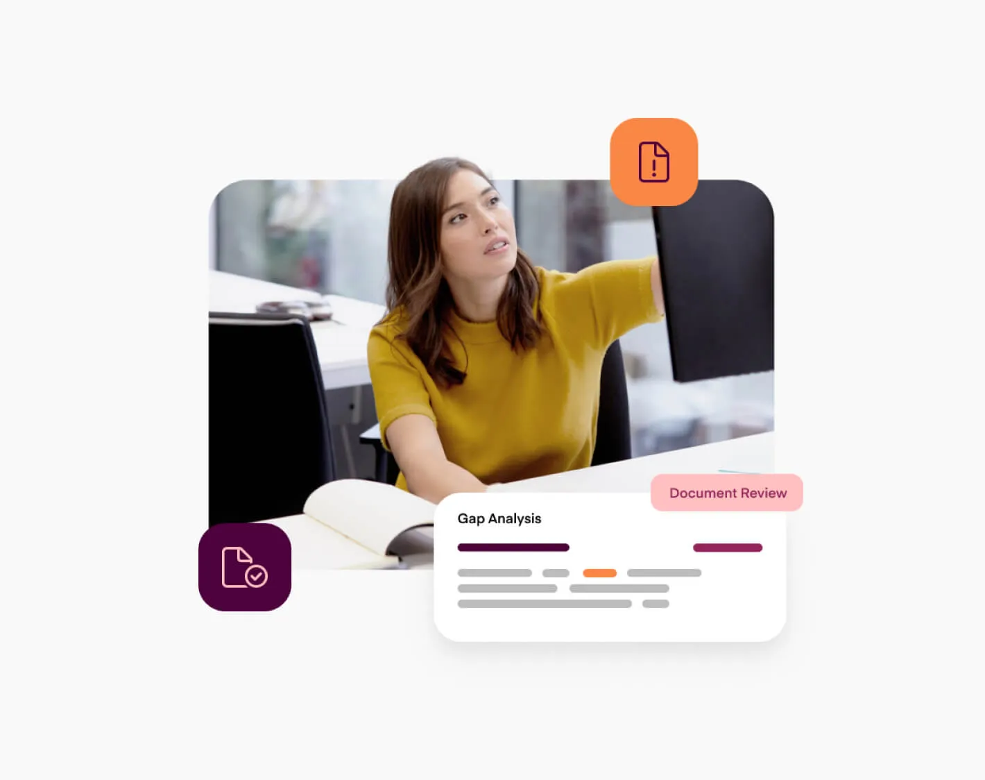
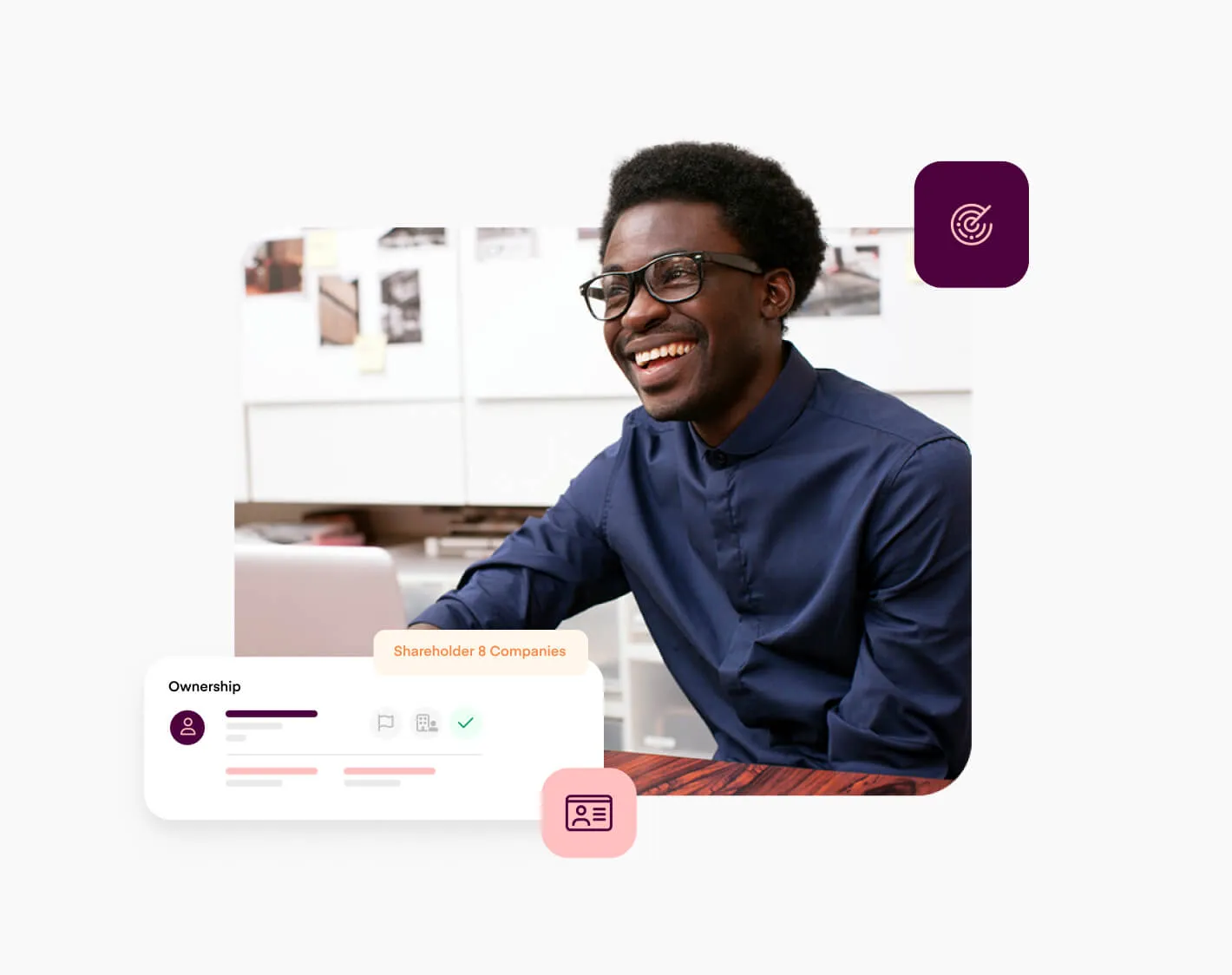
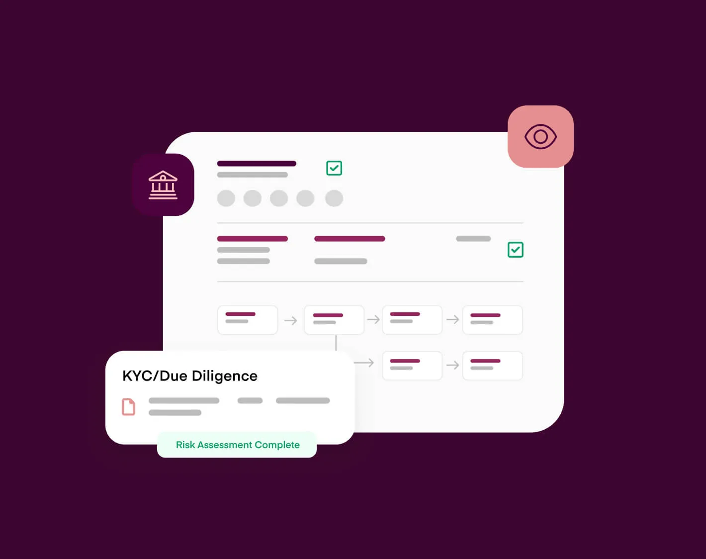
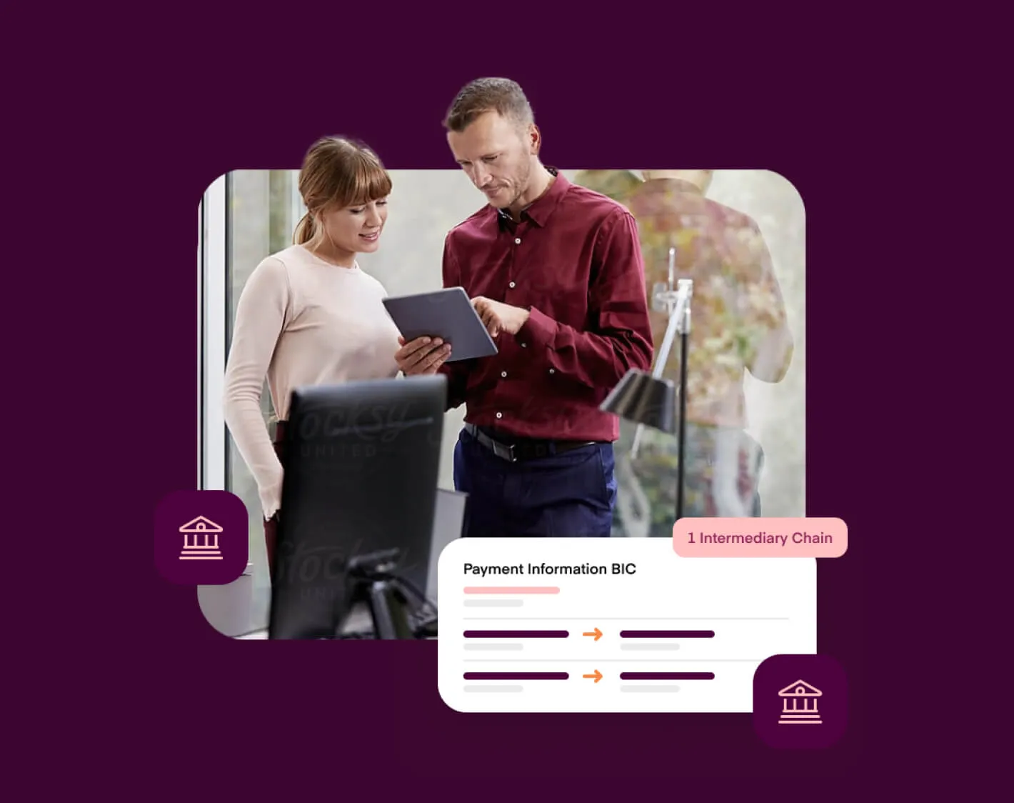
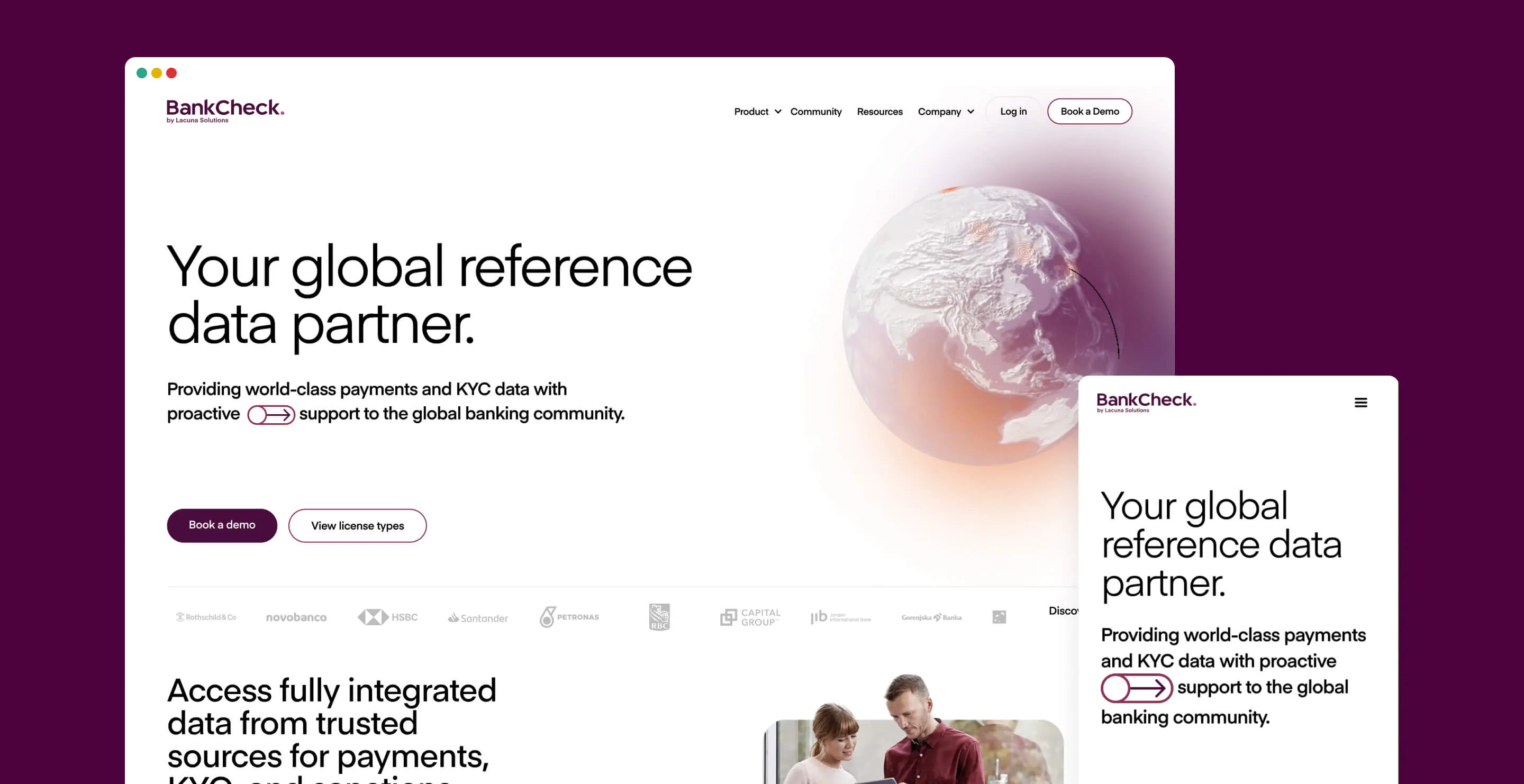
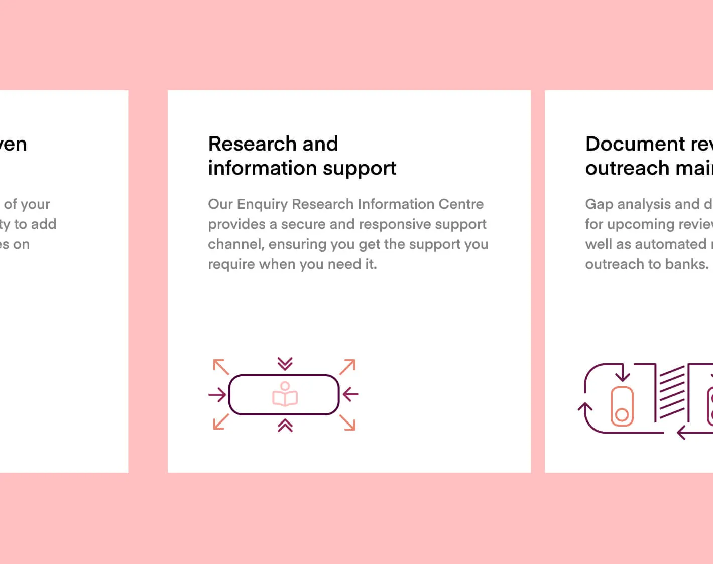
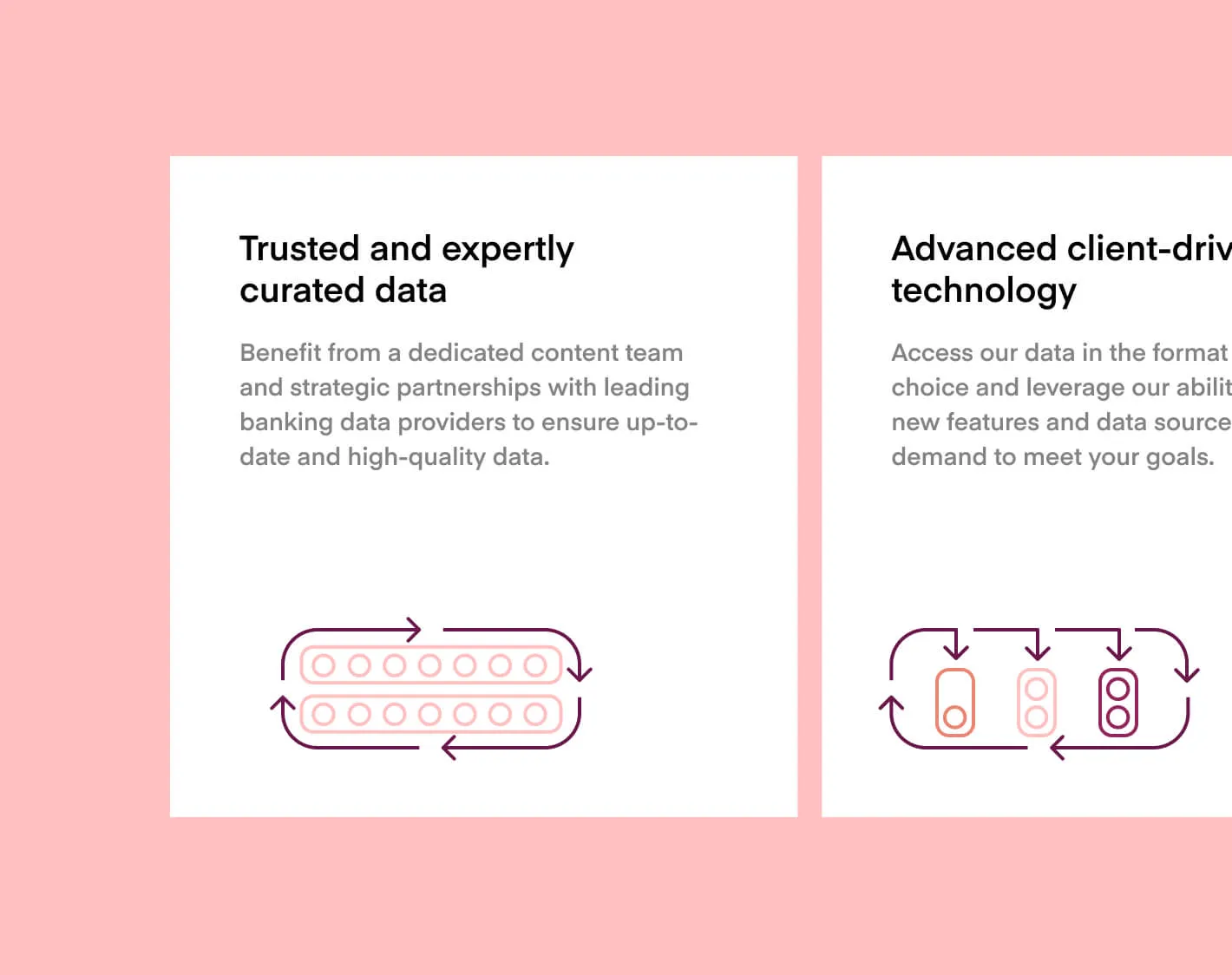
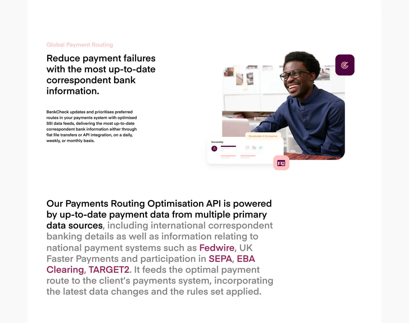
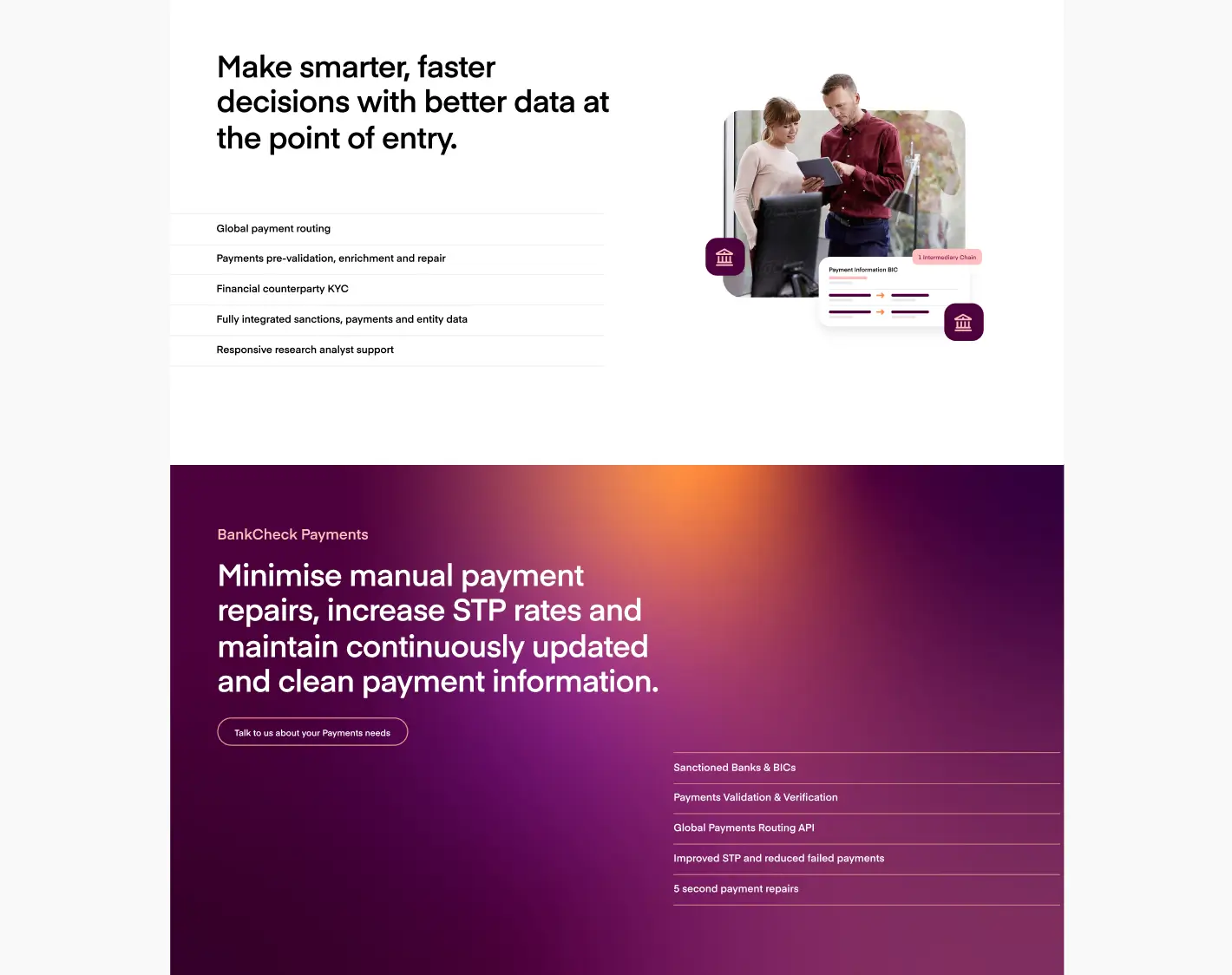
With the website we had an exciting opportunity to be different and bold, with a direction of clean, clear and human. We utilised animation to help complement the narrative while not being overly intrusive. We also looked at illustrative UI with photography to represent their individual product features.
No items found.
The animated globe we created for the website represented their payment routing service and ability to understand the transfer of data information globally.
No items found.
No items found.
No items found.