

Crafting a standout brand identity and story for Vis-Á-Vis Health, which would help them convey their true value.
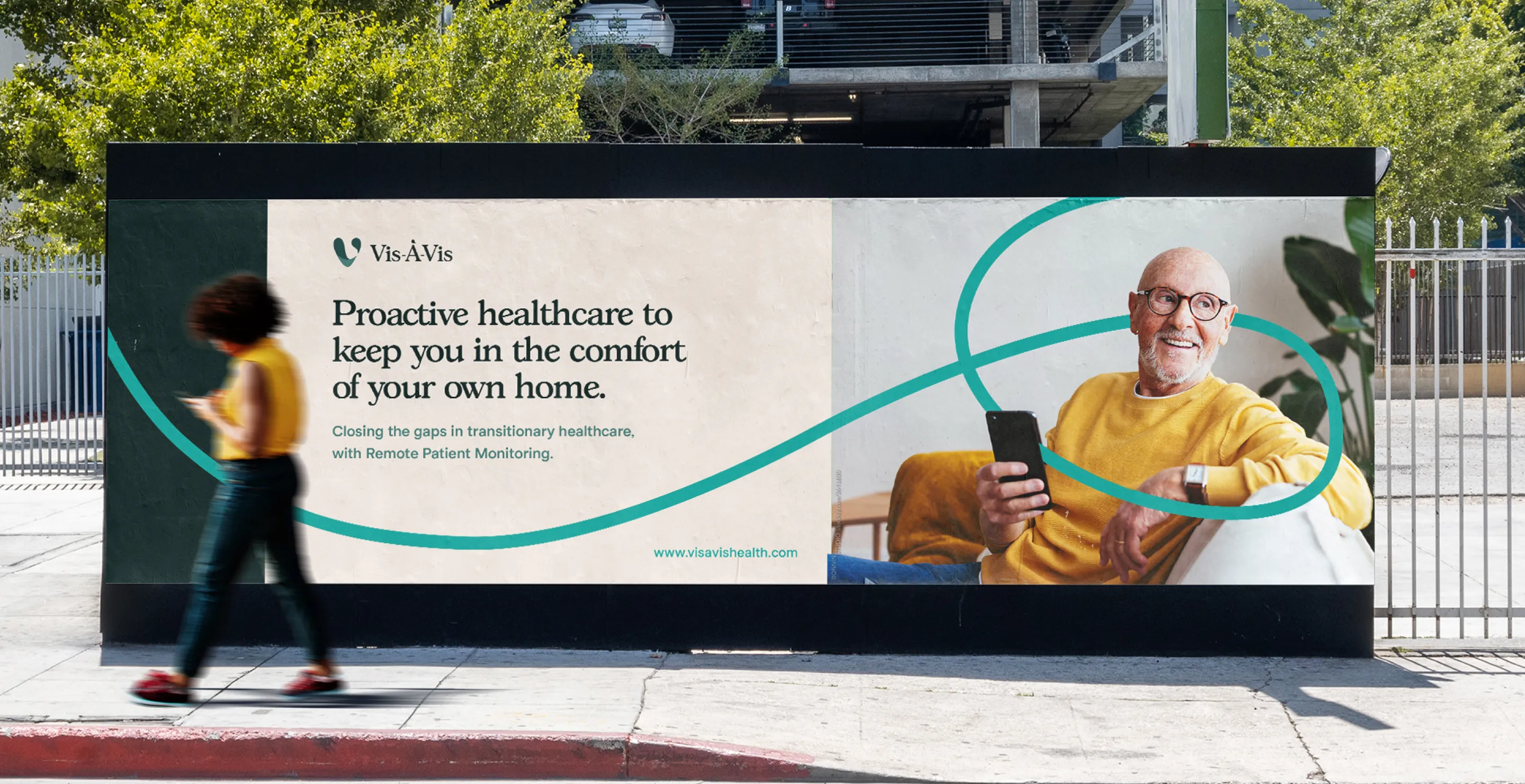
Vis-À-Vis bring measurable outcomes to the people they serve - from patients being able to stay in their own homes to hospitals freeing up resources.
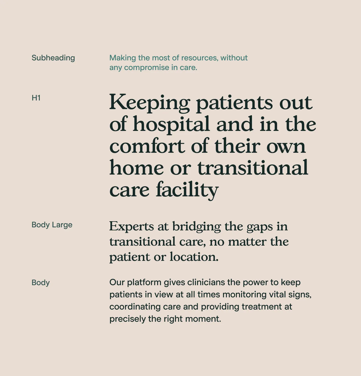
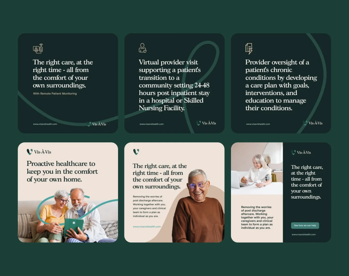
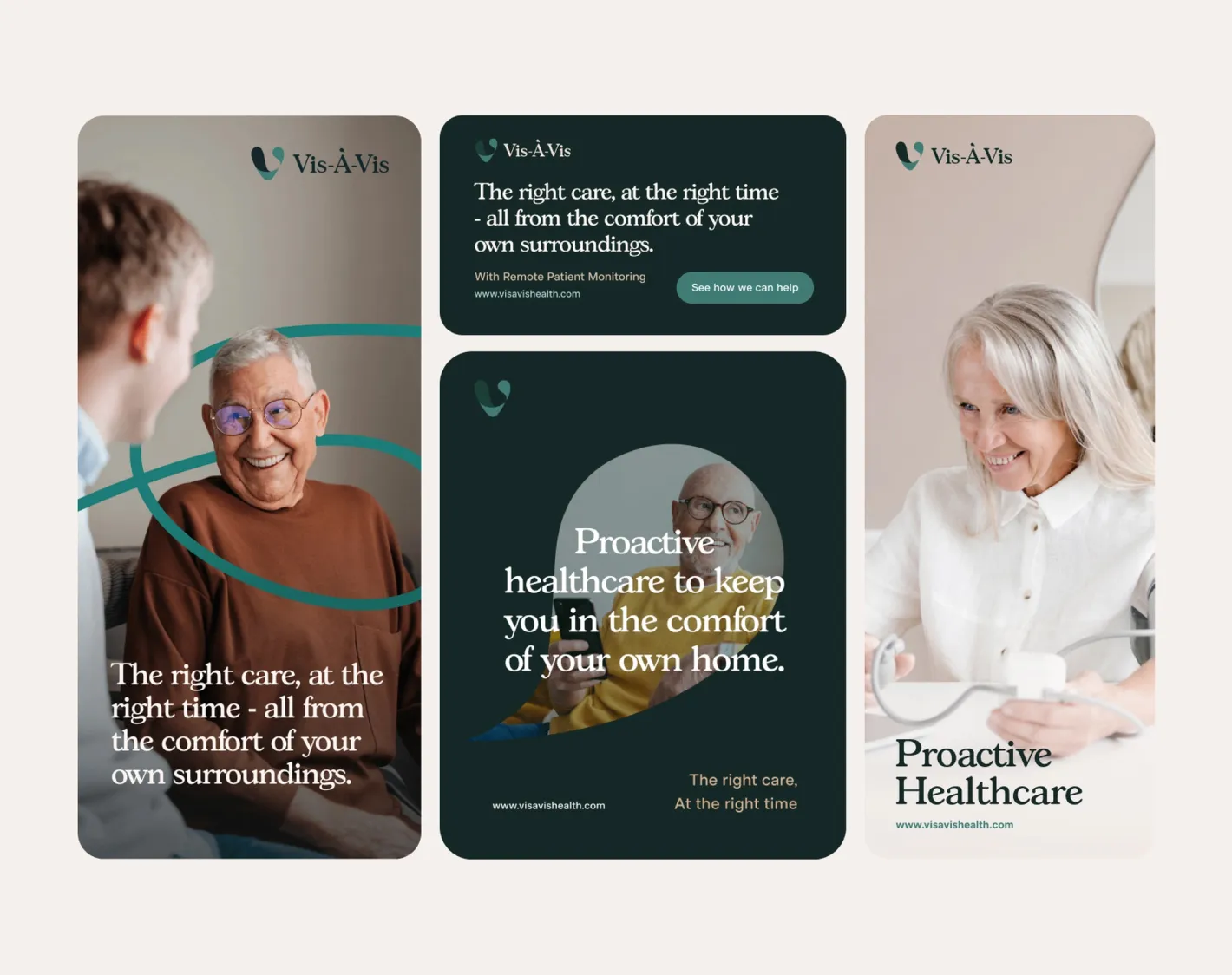
They needed a framework and library of which had a consistent brand story and visual treatment, so we started by crafting the identity and story first.
No items found.
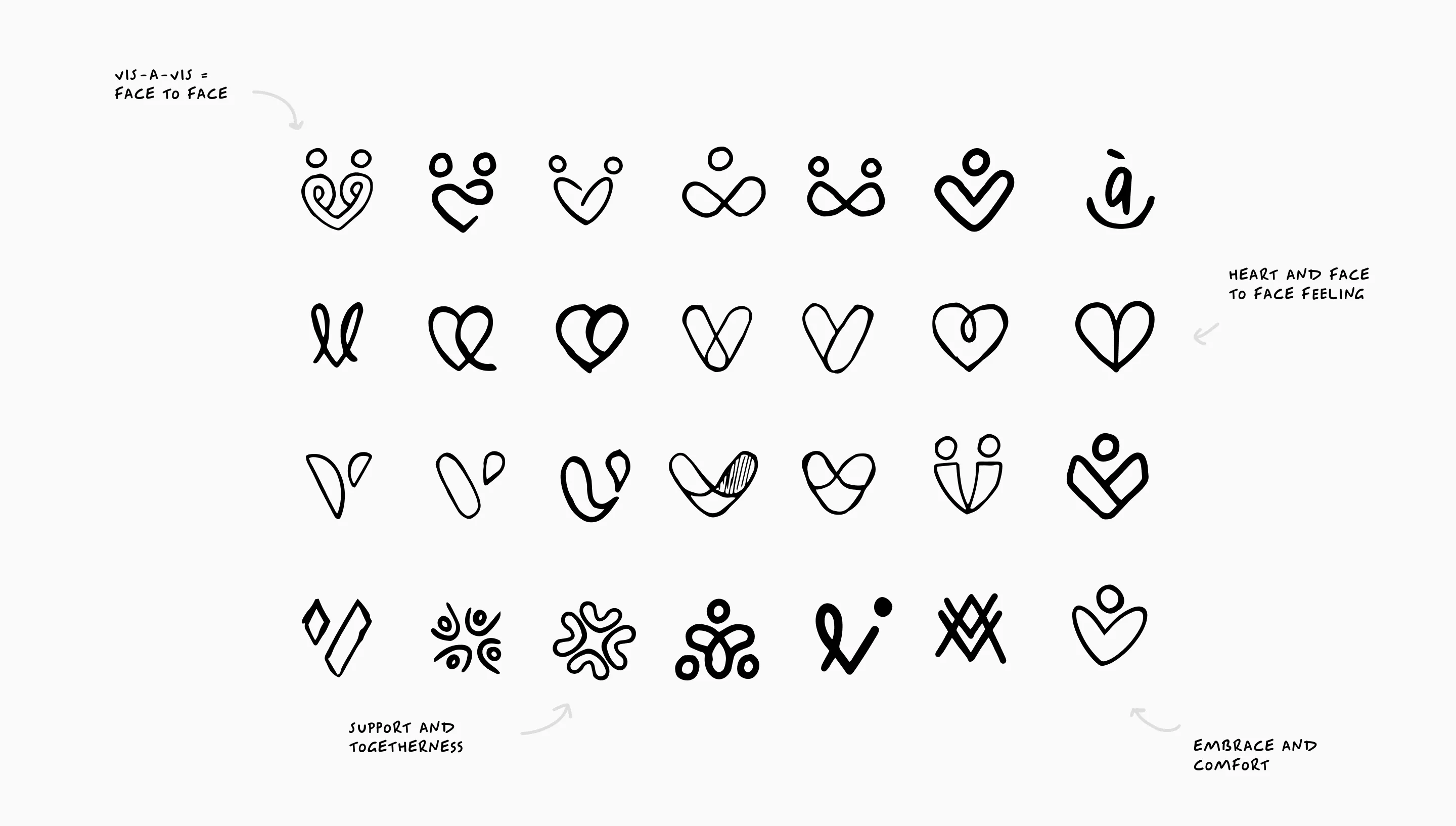
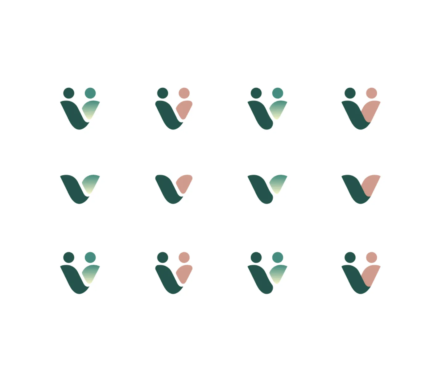
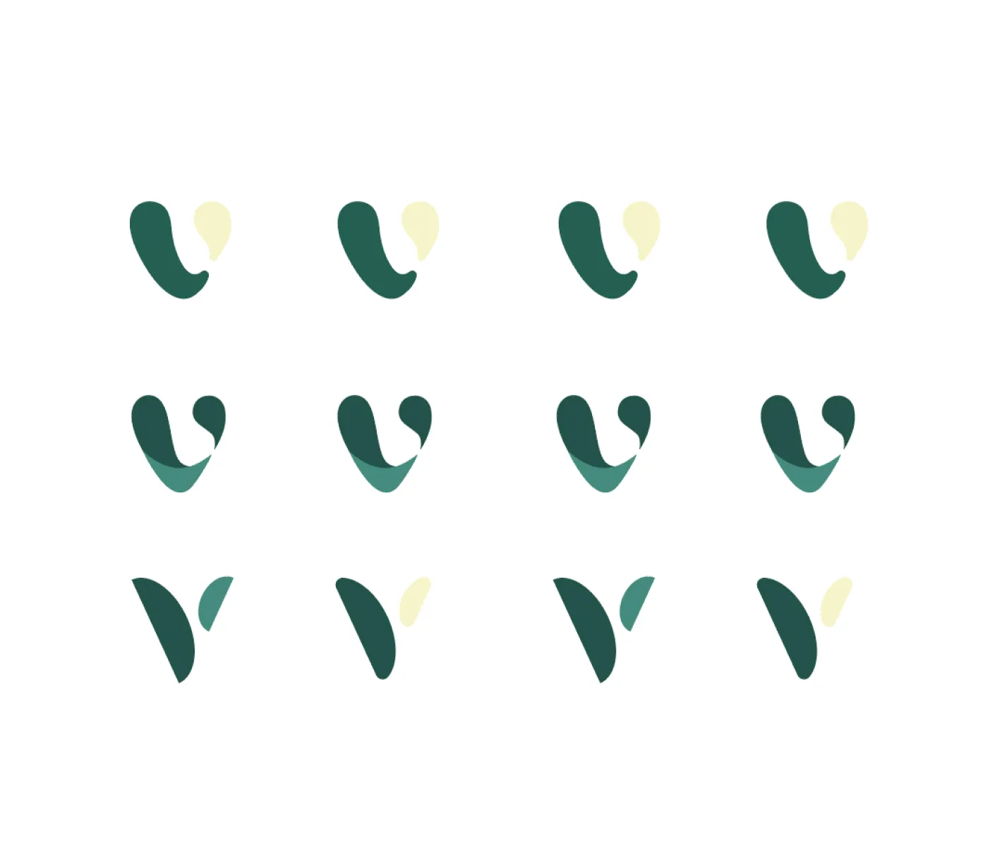
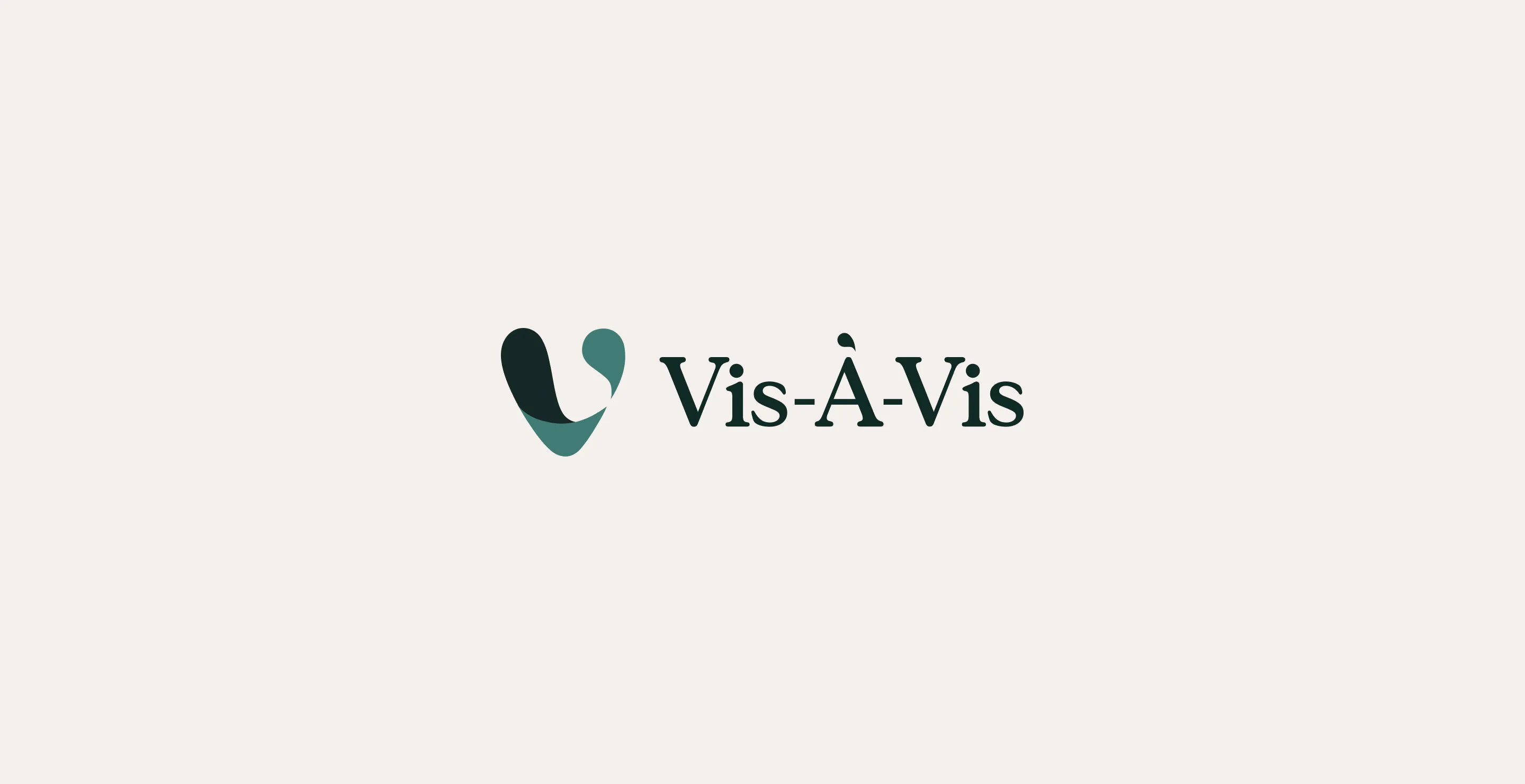
Vis-À-Vis simply translates to Face to Face and playing on the idea of remote patient care, we looked at crafting an identity which would feel comforting and secure, with an emphasis on trust.
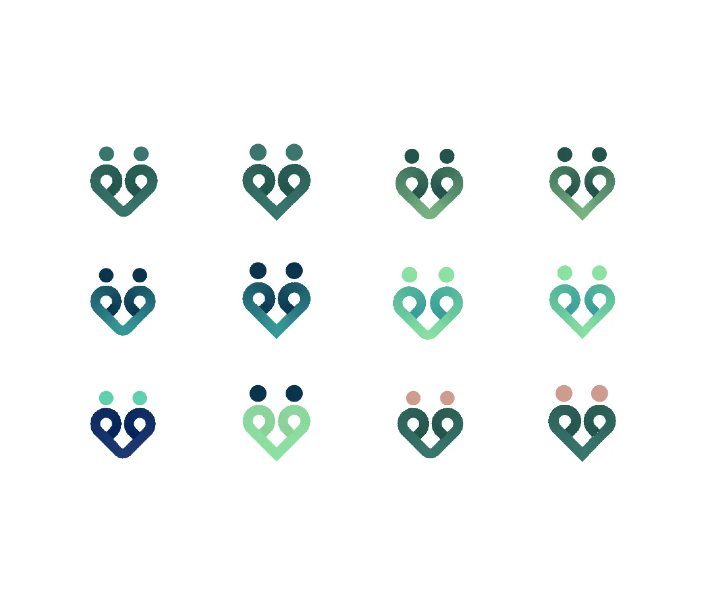
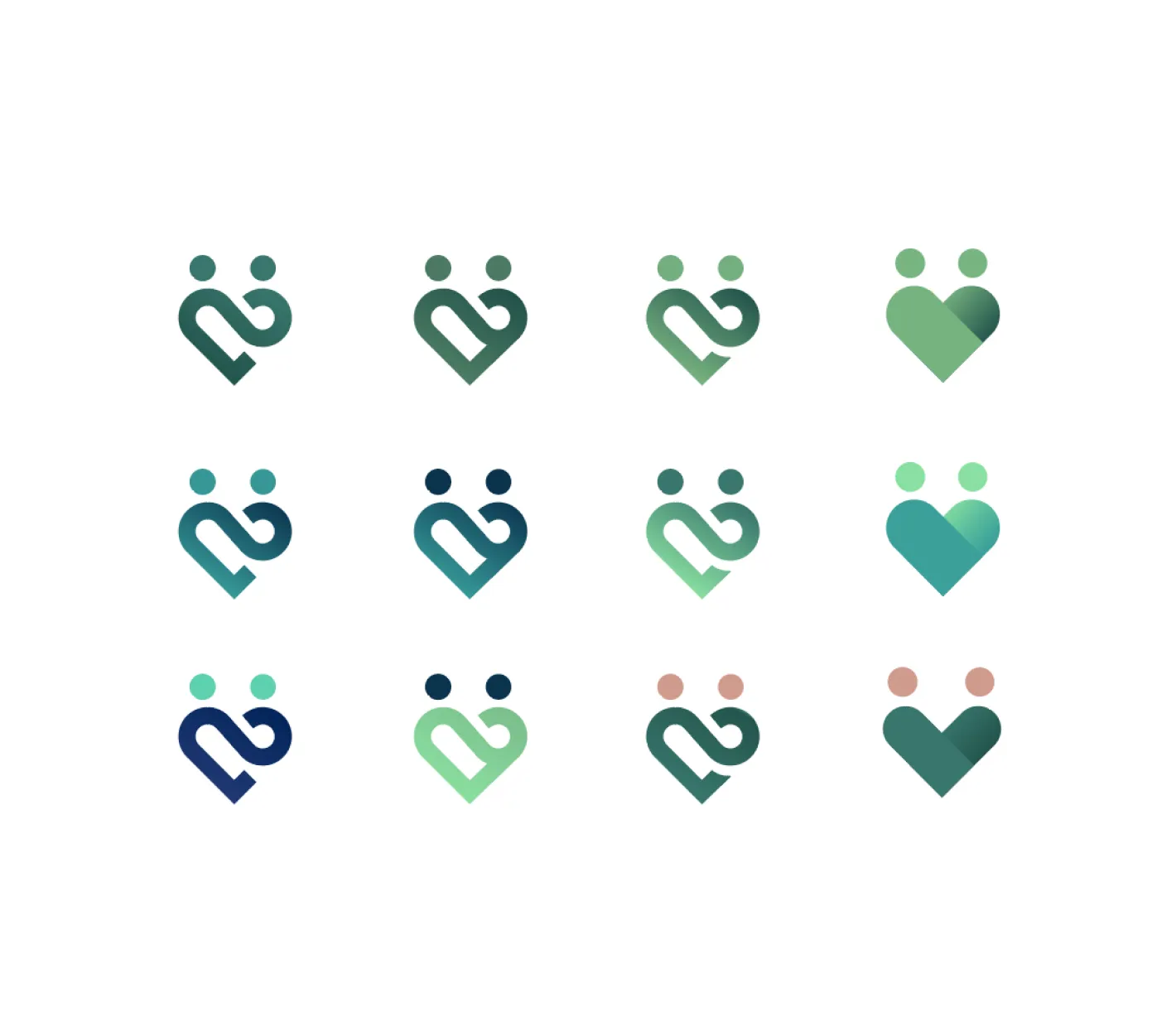
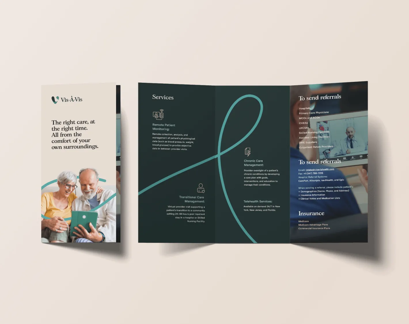
The team wanted to stand away from the usual color palettes which are synonymous with their industry while not feeling too contrasting to their elderly demographic. We incorporated the visual treatment of the ribbon to symbolise that patients and healthcare professionals were not alone and the ribbon was the hug (comfort) and support (trust) they would need.


No items found.
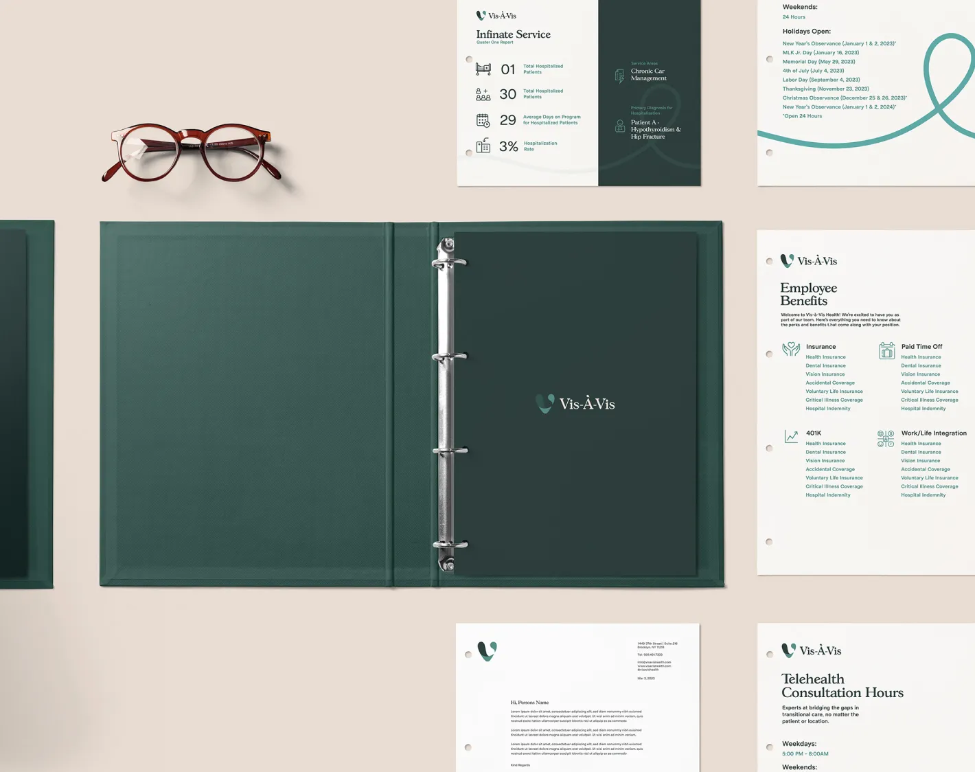
Once we had solidified the Identity and visual direction we began to craft all of the collateral the team would need to communicate both internally and externally from brochures to manuals and sales decks to documentation.


No items found.
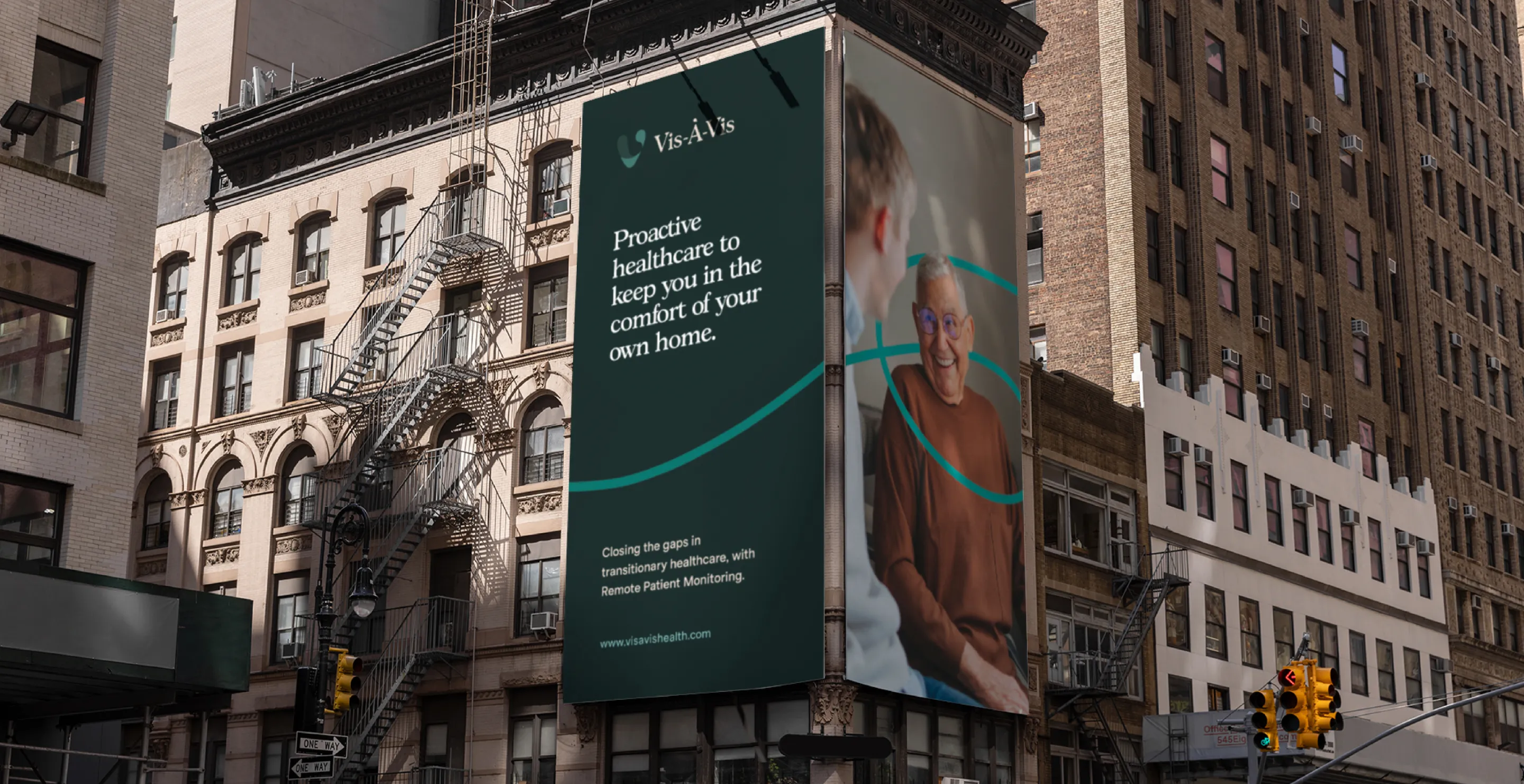
We didn't forget to provide ad and social examples as part of the brand application too.
The Vis-À-Vis team were inspiring and passionate and so collaborative during the entire process - sharing all the time and pushing back in the best way, so we could all arrive at the best and most impactful outcomes.
No items found.
No items found.
No items found.