
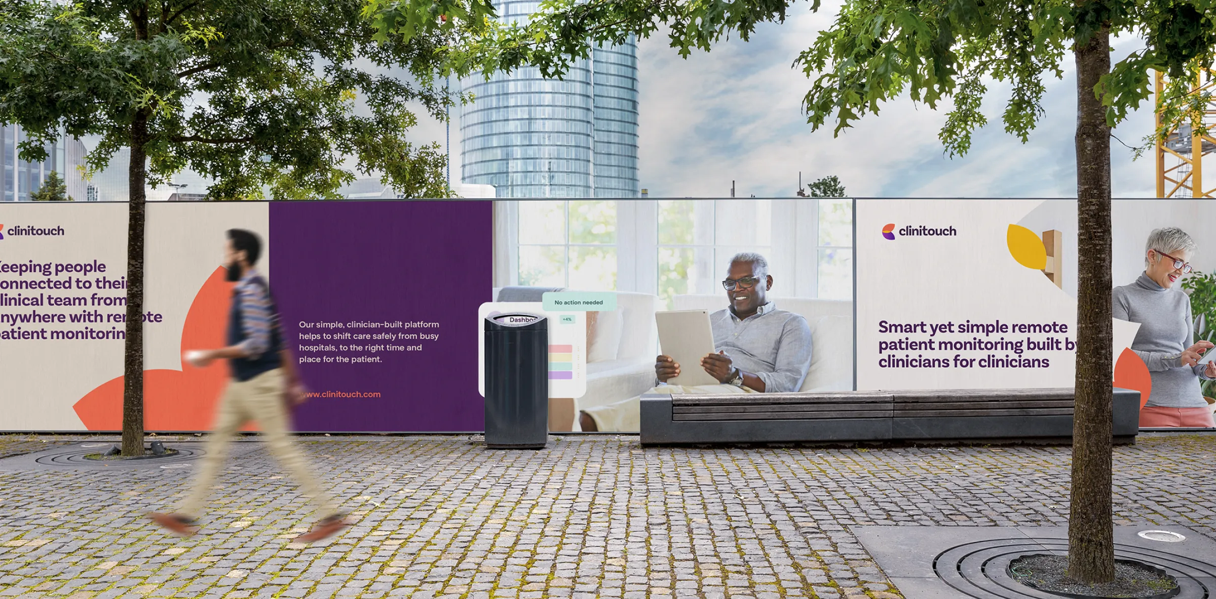


Crafting a new identity, narrative, marketing content, platform design and complete Webflow website for a healthcare company.
Spirit Health came to us wanting to differentiate their Clinitouch product from competitors.
Although Spirit Health was established throughout many NHS trusts in the UK, they wanted the product Clinitouch to be a stand alone brand whilst still maintaining a refined connection to their Spirit Brand and their beginnings.
We got to work with Discovery and Documentation where we quickly uncovered that Clinitouch’s first-hand experience and understanding of clinical and patient needs is their silver bullet.

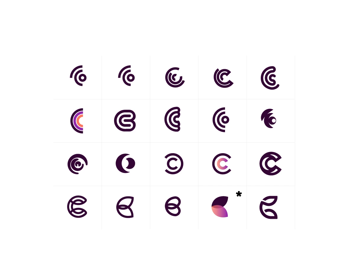

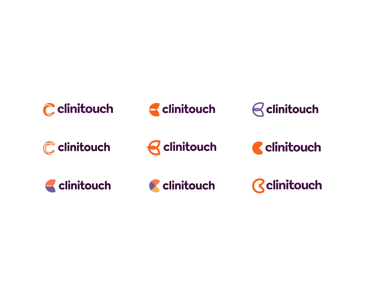

Exploring logo concepts around easily connecting clinicians to their patients (and vice versa) along with the emotions that accessible and high-quality healthcare can bring to people’s lives.
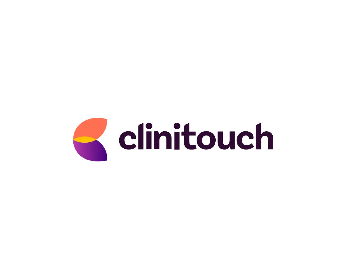
Inviting company-wide voting into the phases to land on an identity signifying the importance of overlapping connections that happens when looking after people’s health and a complementing colour palette to Spirit Health while being nothing like their competitors.


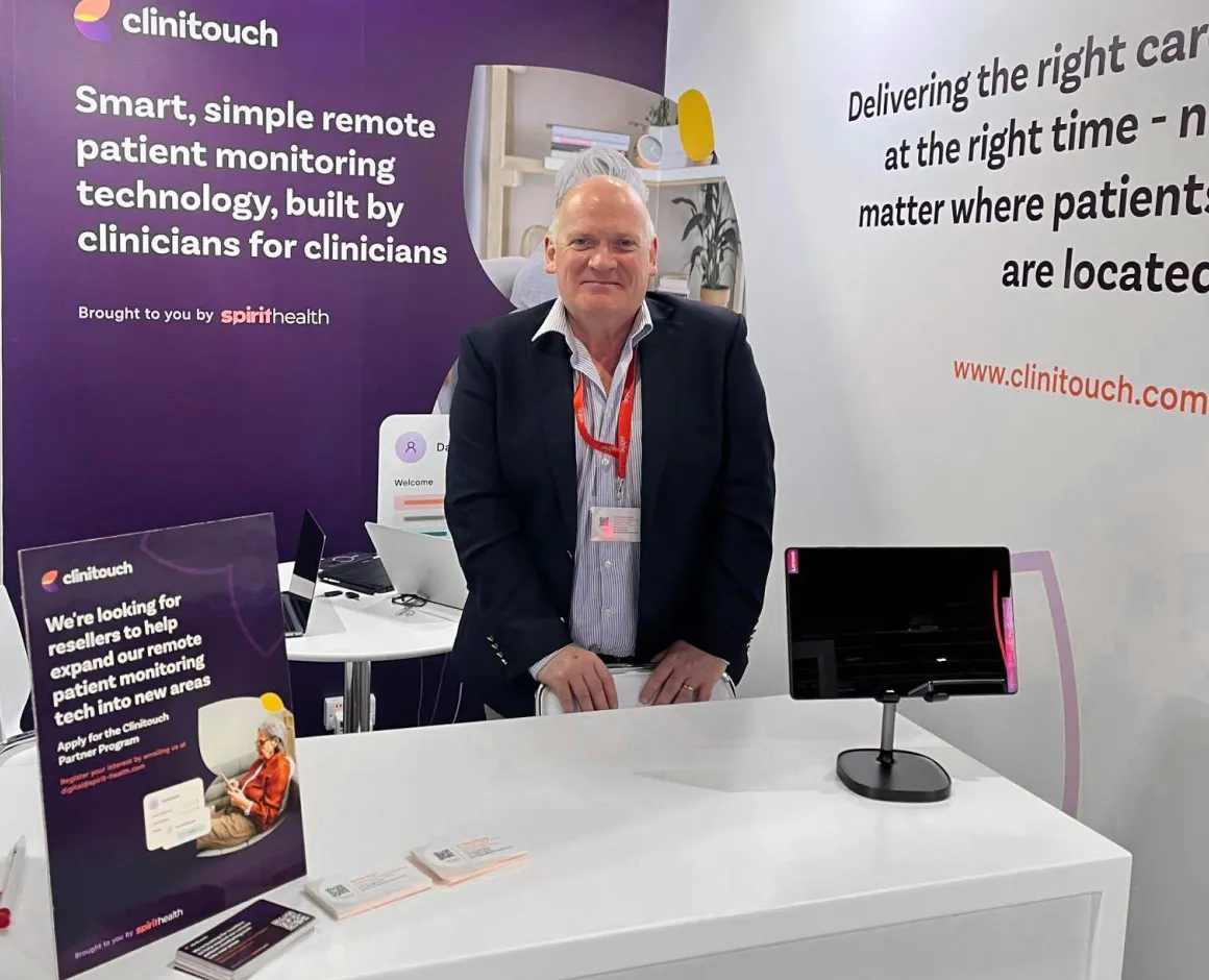
The brand born we continued work into marketing material showing how the brand is applied and developing all the material they would need both online and offline.
We also worked on crafting their brand stories. Mission, values, purpose, culture. Along with statements and marketing content narratives we eventually landed on.
Smart, simple remote patient monitoring technology, build by clinicians for clinicians.
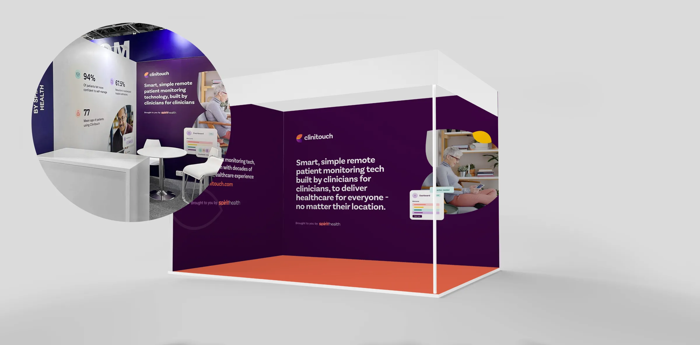
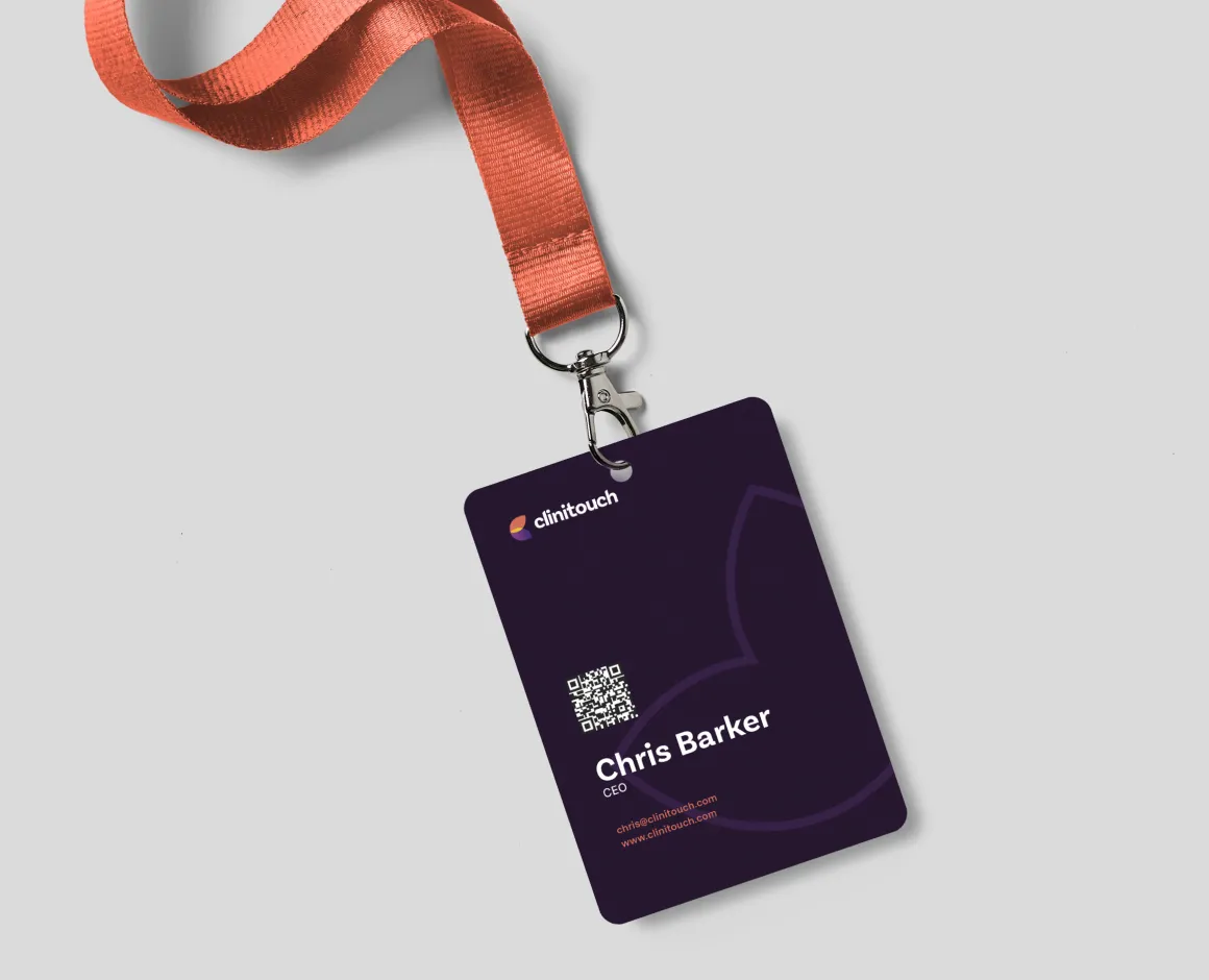
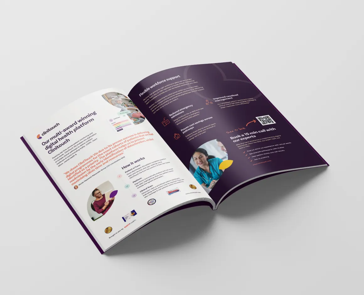
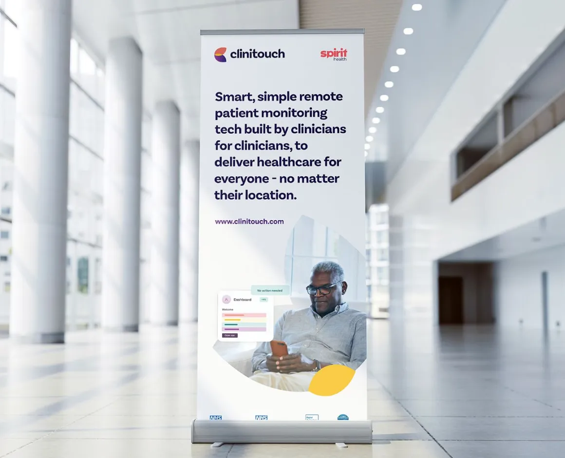
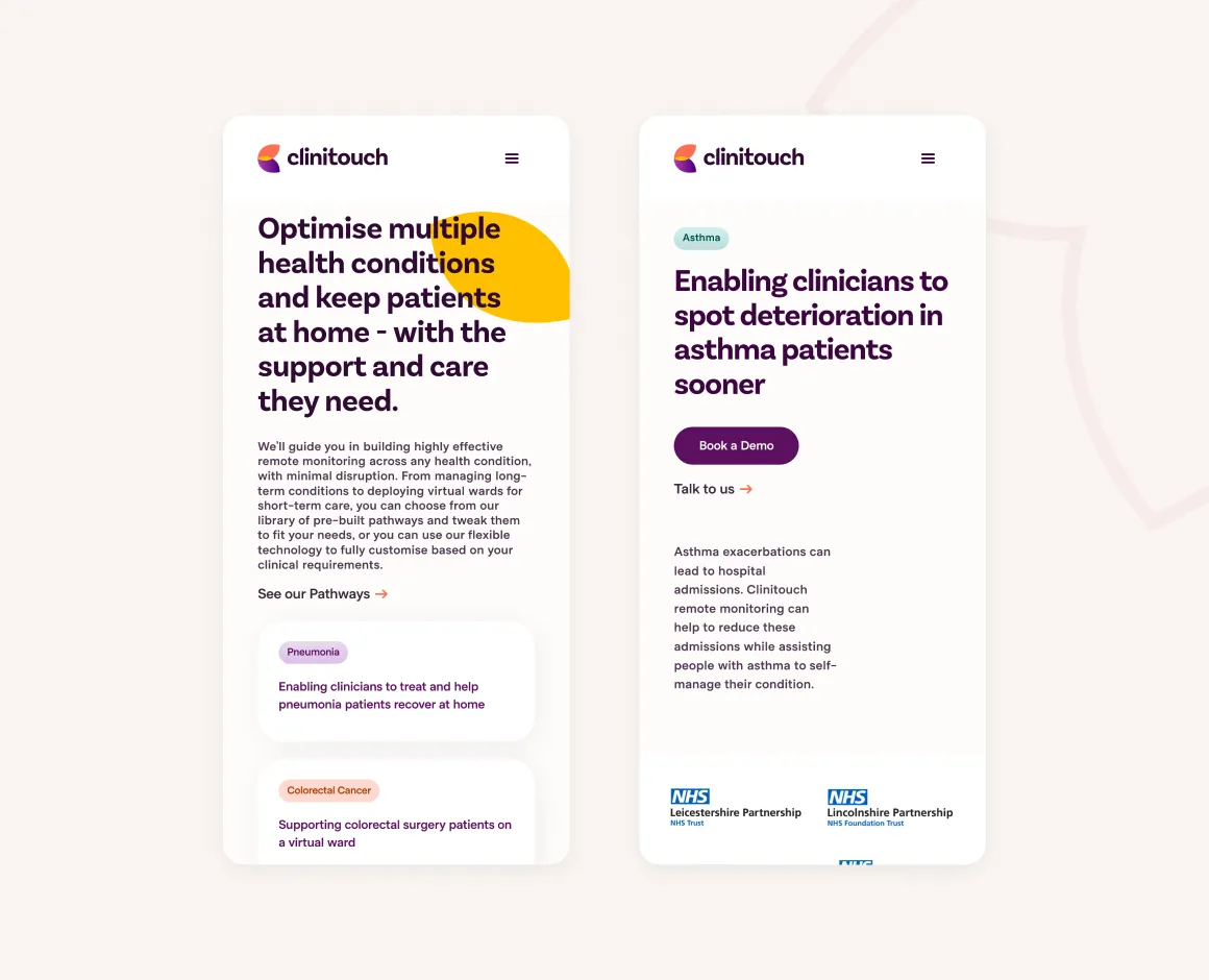
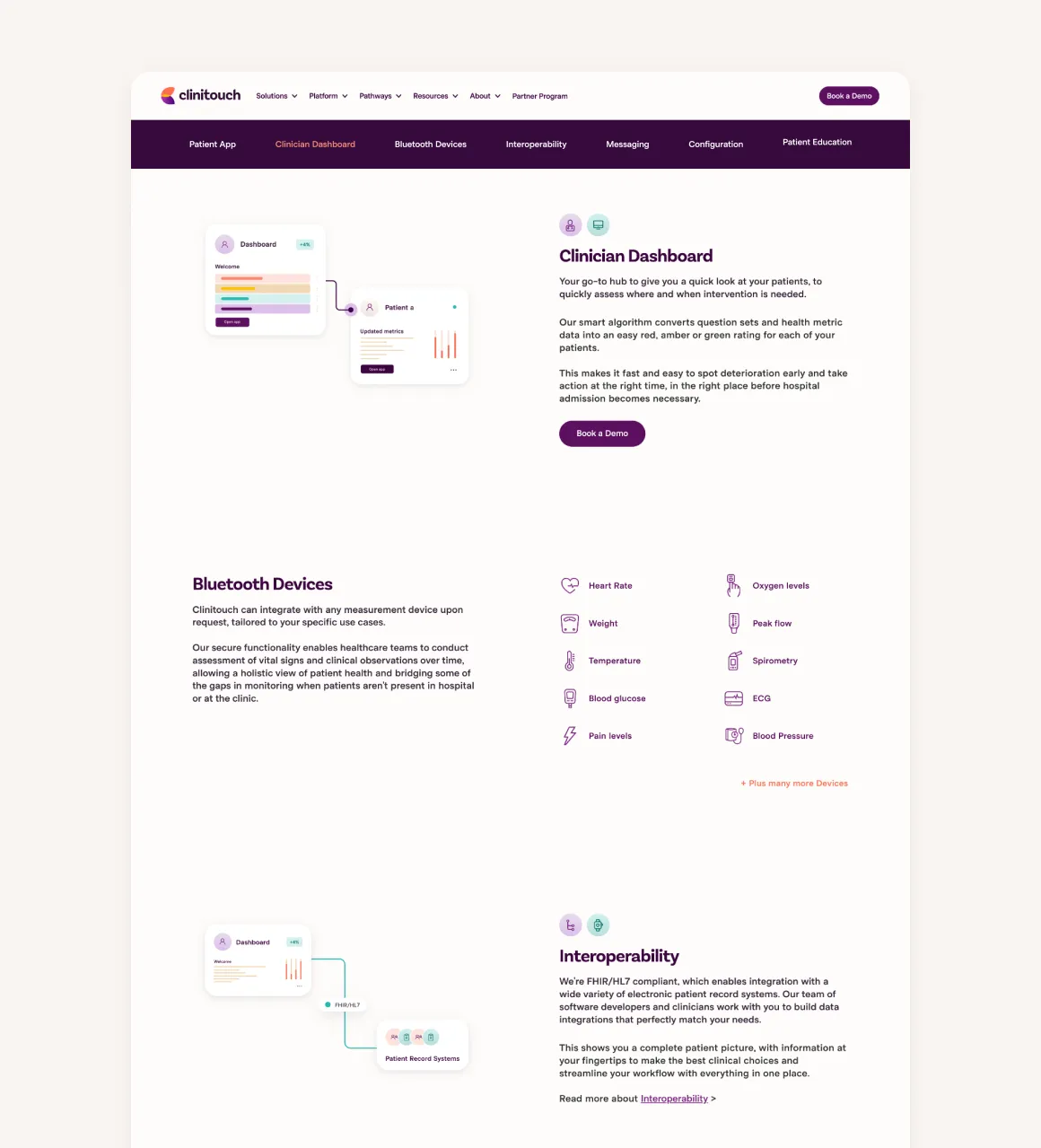
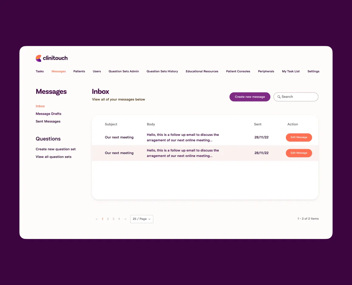
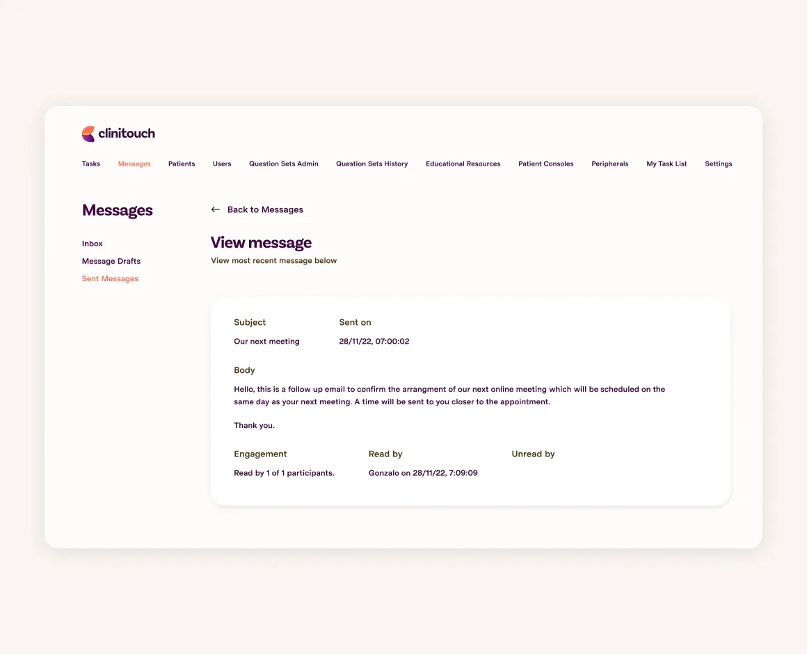
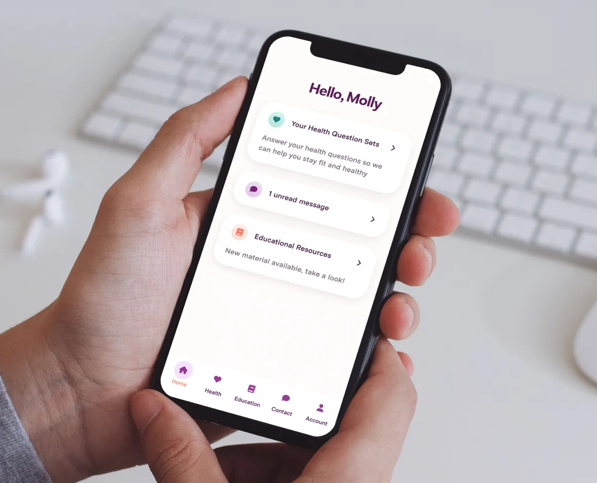
Now was the part for the website and platform, we looked at different applications of UI with photography to quickly convey features and benefits, as well as keeping the story simple and compelling.
During the process we looked at providing as much autonomy as possible within Webflow. Integrating Pardot and clear tracking for qualified leads. Post launch we did training not just on the editor side of Webflow but the design side too so they could maximise their content creation going forward.
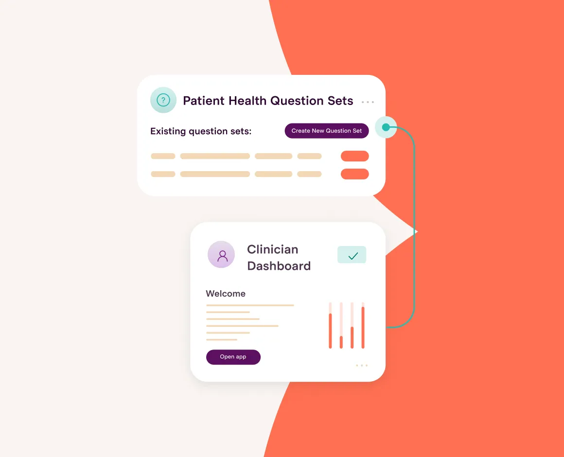
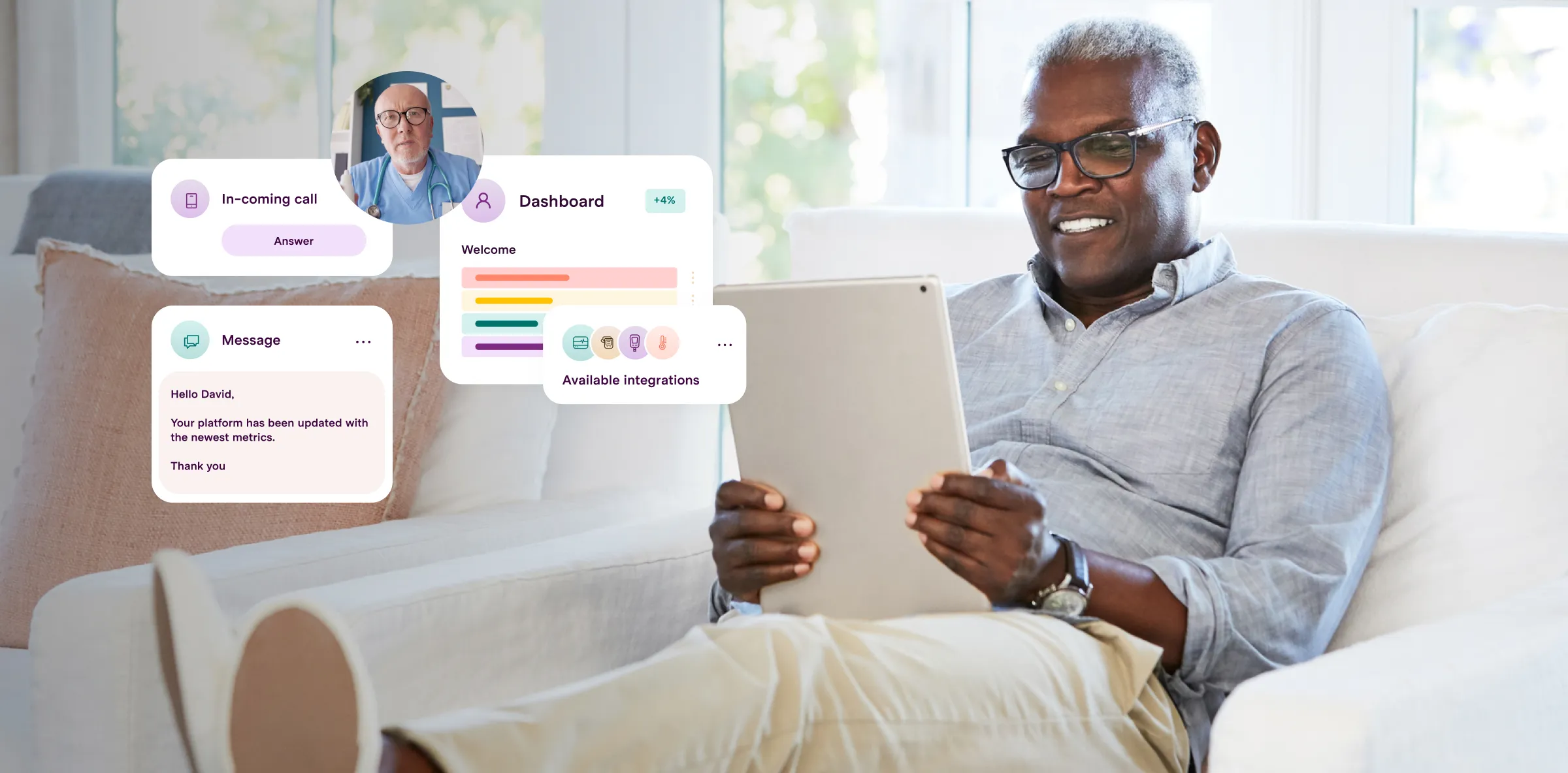

A complete overhaul of the UI on the clinitouch platform both on the patient side and clinician dashboard. This was supported with a full design system for their products going forward.


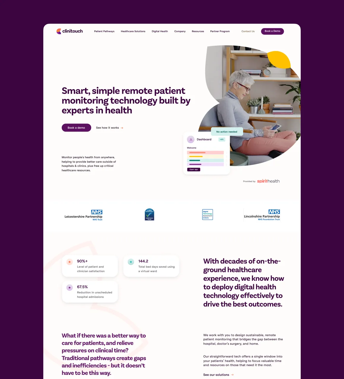
"The team at Gravita led us through a complete brand refresh and website overhaul to help modernise our health-tech product offering ahead of our global expansion programme.
We were over the moon with the result – we feel the branding really helps position us as an international tech innovator, while also remaining true to our 'people-focused' roots and focus on genuinely making a difference in the world. From the outset, the team went out of their way to understand our brand purpose, what makes us “us”, and did a great job of conveying some complex themes in a clean and simple way.
Gravita’s emphasis on nailing the brand’s purpose and really understanding the brief in the early stages of the project, meant it was super quick and easy to produce all of the materials once the identity was settled on. They have a methodology that works well and is much more efficient than other branding agencies I have worked with. I’d recommend any tech-focused, mission-led organisation work with Gravita on branding and digital projects, for a straightforward and really effective service.
Jamie Starr, Marketing Director, Clinitouch"
